
A modern logo design and visual brand system for Squares N Acres, a real estate agency. Built around clean geometry, a custom growth graph motif, and architectural alignment to signify trust and property expansion.
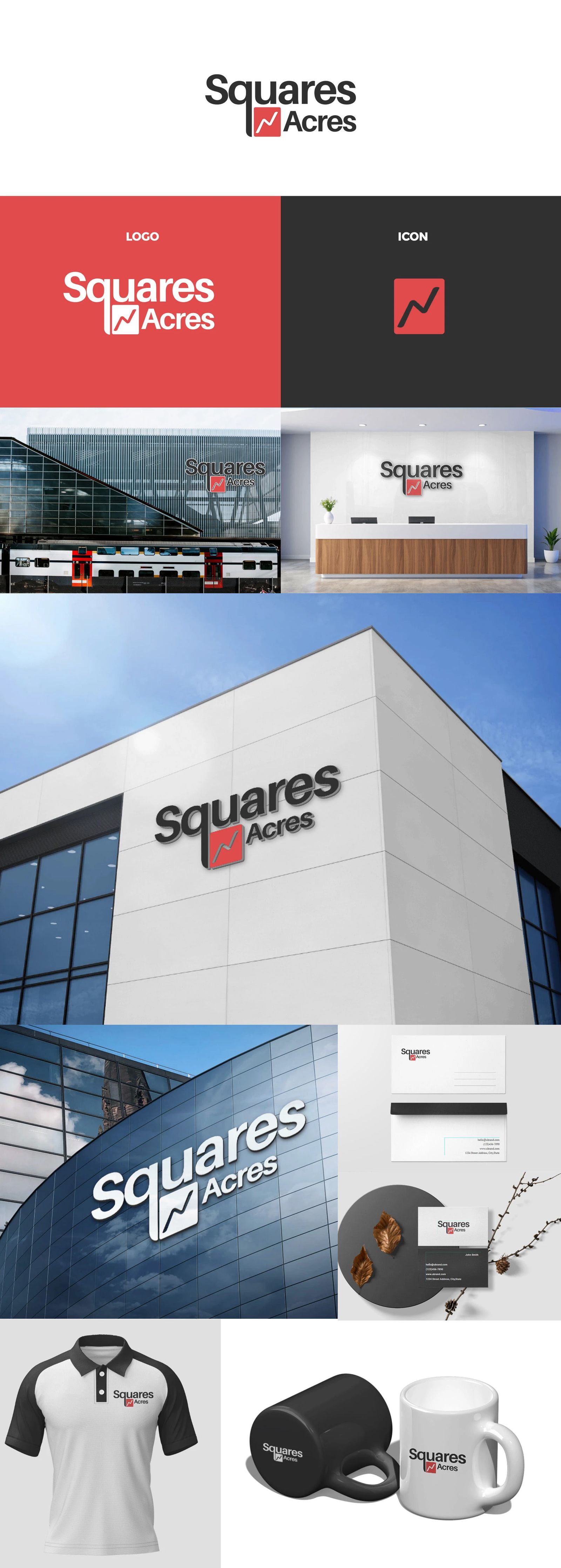
Squares N Acres required a distinct, professional identity to represent their real estate and property consultancy services. The goal was to craft a bold, trustworthy logo mark that communicates structural stability, financial growth, and real estate expertise across both digital platforms and physical property signage.
Icon & Geometry: Combined the solid geometry of a square (symbolizing land plots and building foundations) with an integrated upward-trending graph arrow (symbolizing property value growth and investment returns).
Color Palette: Utilized a strong combination of deep crimson red and charcoal grey to evoke strength, authority, and modern sophistication.
Typography: Selected a bold, structured sans-serif typeface to maintain maximum readability across large outdoor billboards, building facades, corporate apparel, and stationery.
Delivered a highly versatile visual mark tailored for physical real estate signage, corporate collateral, office interiors, and digital platforms.
Explore More: Check out the full, high-resolution presentation for this project on my Behance and Dribbble profiles.
Disclaimer: This project was created during my employment. This work is displayed strictly for portfolio, educational, and design demonstration purposes only.