
The goal was to create a distinctive visual identity for Search Homes India that reflects the real estate search experience while communicating the brand’s values of optimism, energy, trust, innovation, and growth.

The goal was to create a distinctive visual identity for Search Homes India that reflects the real estate search experience while communicating the brand’s values of optimism, energy, trust, innovation, and growth.
Typography: The Articulat CF Bold typeface gives the logo a strong, confident presence, reflecting the importance of a solid foundation in real estate.
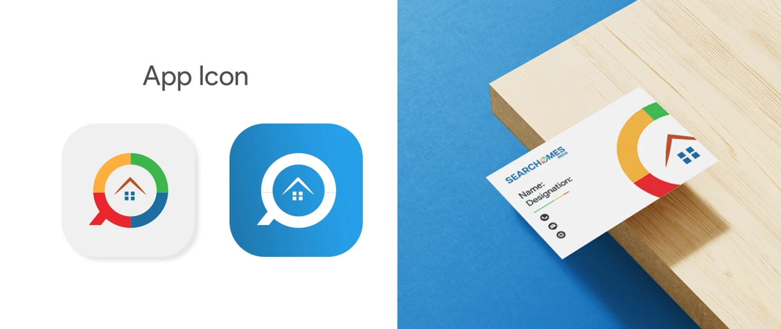
Magnifying Glass: Represents property search and discovery, highlighting the process of exploring different homes and properties.
Windows: Symbolize the variety of property options available through the platform.
Upward Arrow: Represents the idea of home, the journey towards finding the right property, and continuous growth and improvement.
Color System: Red represents energy, blue signifies trust, yellow conveys happiness, and green represents freshness. Together, the colors bring clarity, emotion, and visibility to the brand identity.
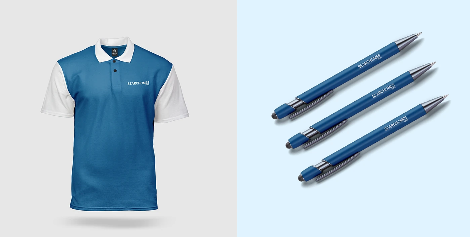
Created a cohesive logo concept and visual identity that connects property discovery with trust, choice, and growth, with supporting logo explanations and design references for developers.
Explore More: Check out the full, high-resolution presentation for this project on my Behance and Dribbble profiles.
Disclaimer: This project was created during my employment. This work is displayed strictly for portfolio, educational, and design demonstration purposes only.