
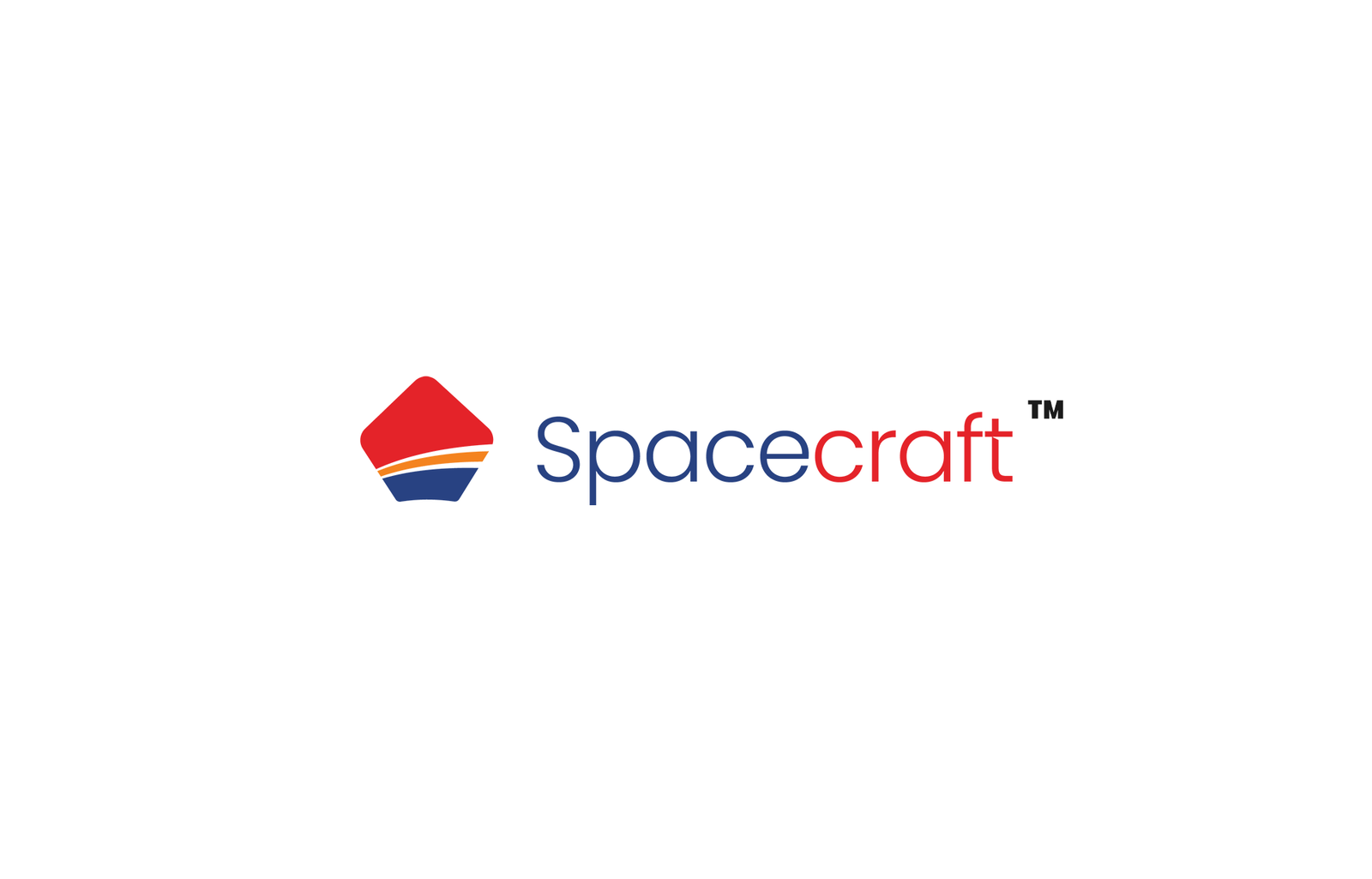
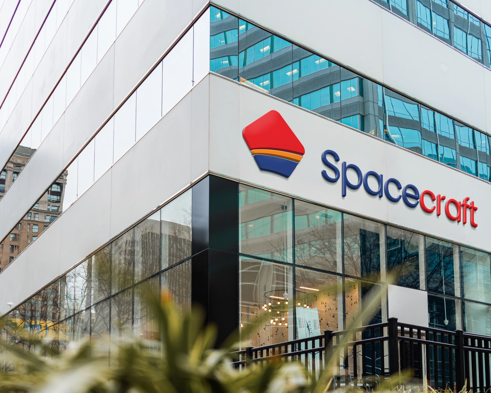
A clean, minimal logo and brand identity designed for Spacecraft, a real estate company. Built to represent a wide range of properties, from budget homes to luxury real estate, while remaining versatile across digital app icons and large physical signage.
Project Overview: Spacecraft is a real estate company that helps clients buy and sell apartments, villas, and plots. They needed a distinct visual mark that clearly communicates property and shelter while appealing to a broad market of property buyers.
The Design Challenge and Process: The goal was to create a simple yet memorable logo that works effortlessly across both digital screens and physical branding. After researching real estate visual trends and testing multiple design iterations, I developed a minimal mark that carries a clear story.
The Home Icon: The foundation of the logo represents a house, instantly signaling real estate and shelter.
The Two Curved Lines: The layered lines within the mark tell a dual story, representing the transition from simple budget friendly properties to high end luxury homes, as well as serving as a one stop destination for both buying and selling properties.
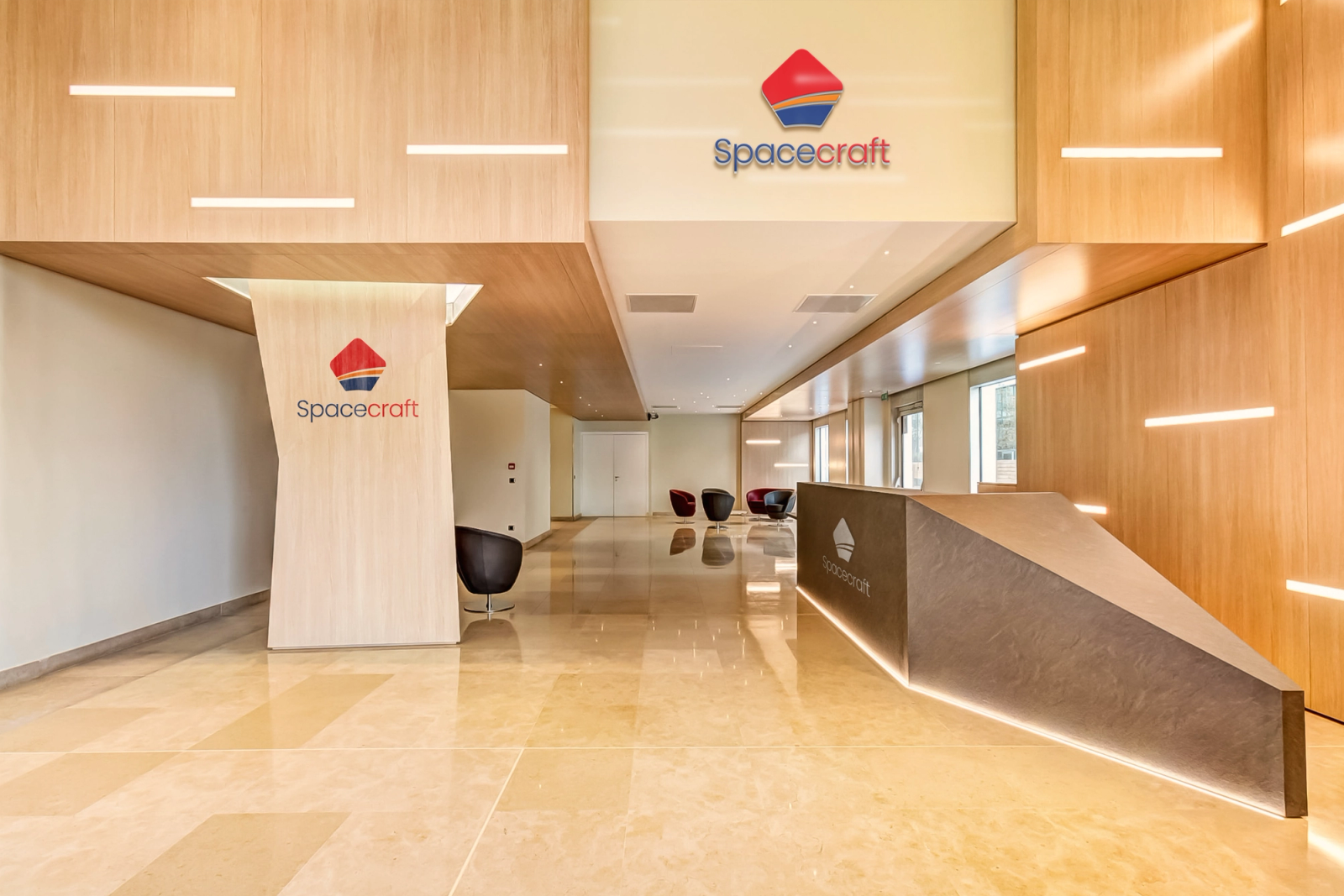
Result and Adaptability: Through careful refinement, the final logo retains its sharp identity at any scale, from a tiny mobile app icon to massive billboard hoardings and building signage.
Explore Full Case Study & Mockups: View the complete project presentation and brand mockups on Behance or check out the design shots on Dribbble.