
A modern logo design and brand identity created for Breakthrough, an IT, business consulting, and outsourcing firm. Designed to step away from traditional corporate tech logos with an out of the box identity.
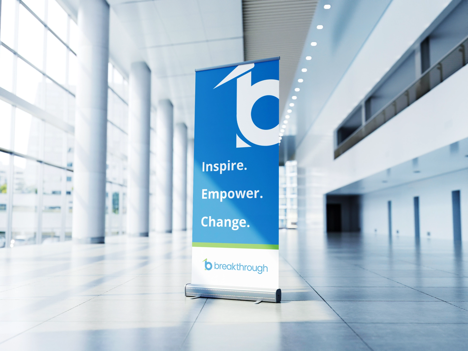
Project Overview: Breakthrough is an information technology company providing business consulting, IT solutions, and outsourcing services. Most corporate IT logos look predictable and repetitive. Given full creative freedom by the client, I set out to build an unconventional logo mark that sets them apart from typical tech consultancies.
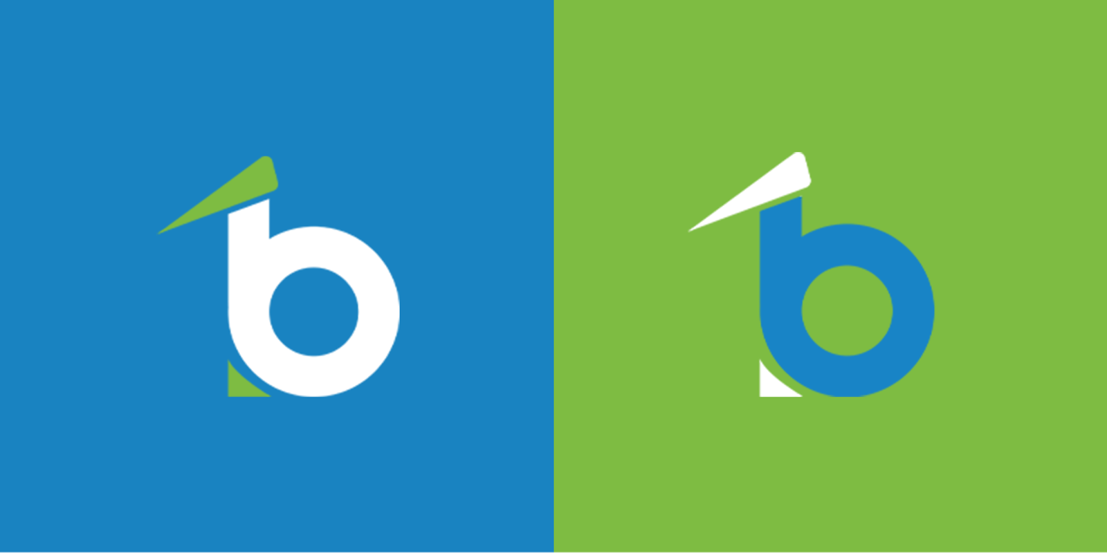
The Design Challenge and Process: Instead of relying on standard technology clichés like circuit patterns or abstract nodes, I focused on creating a bold, out of the box brand mark centered around the letter B:
The Primary Structure: The design begins with the letter B as the core shape, establishing a strong, recognizable foundation.
Seamless Integration: By incorporating an additional geometric shape, the letter T is created within the form.
Two Letters, One Symbol: Rather than placing two separate characters side by side, the design merges B and T into a single cohesive mark, representing unity and modern minimalism.
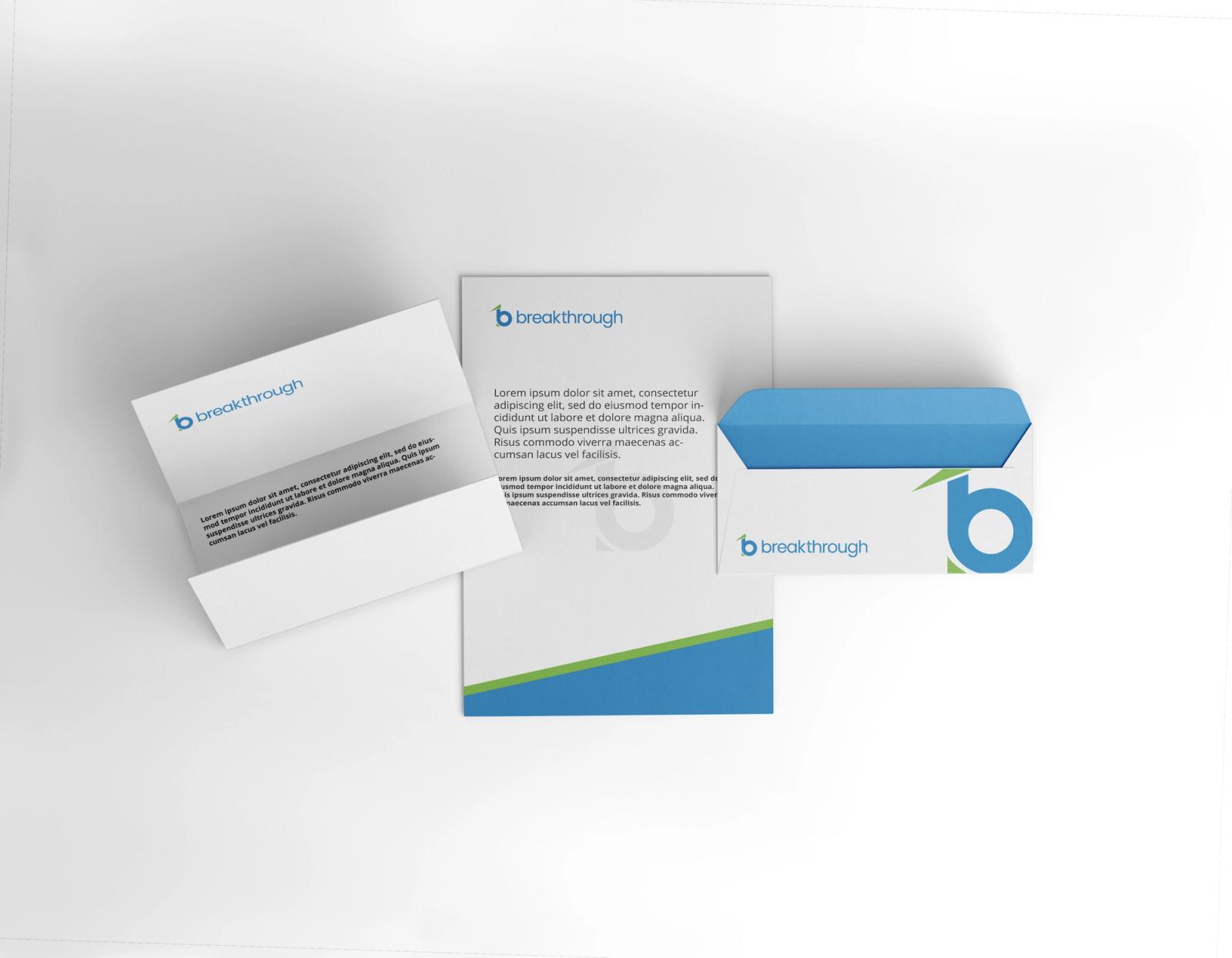
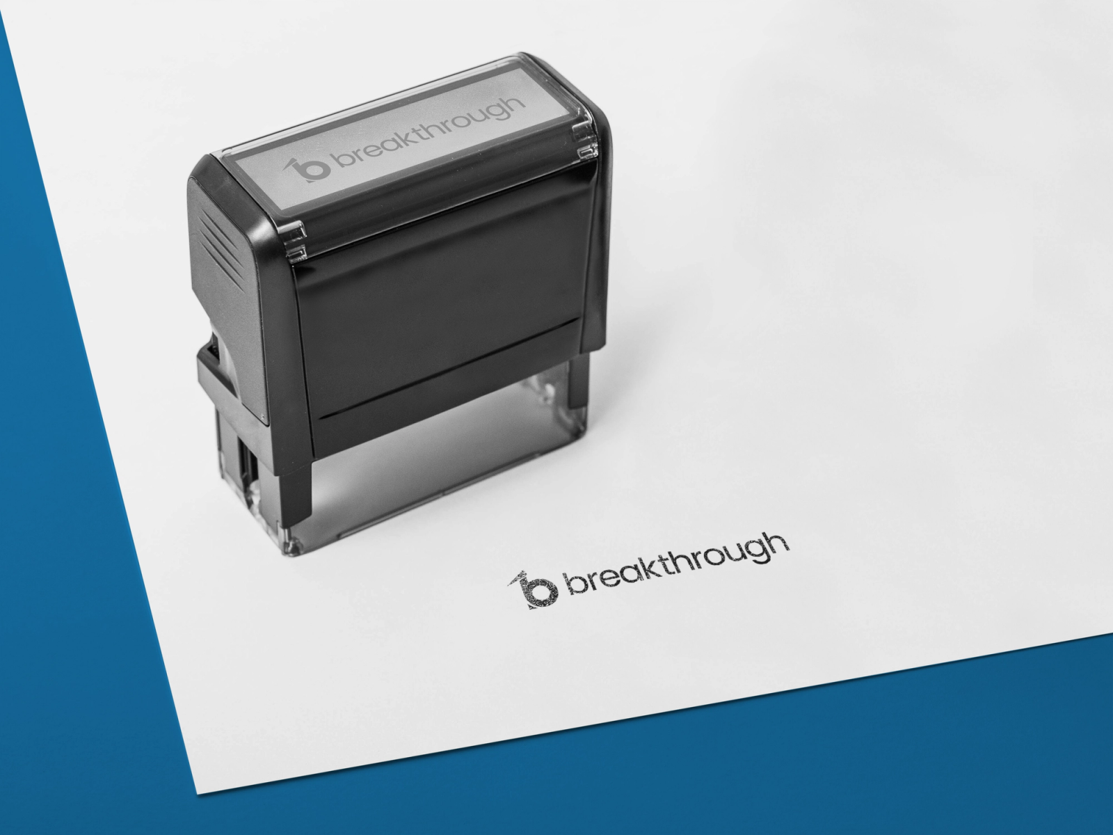
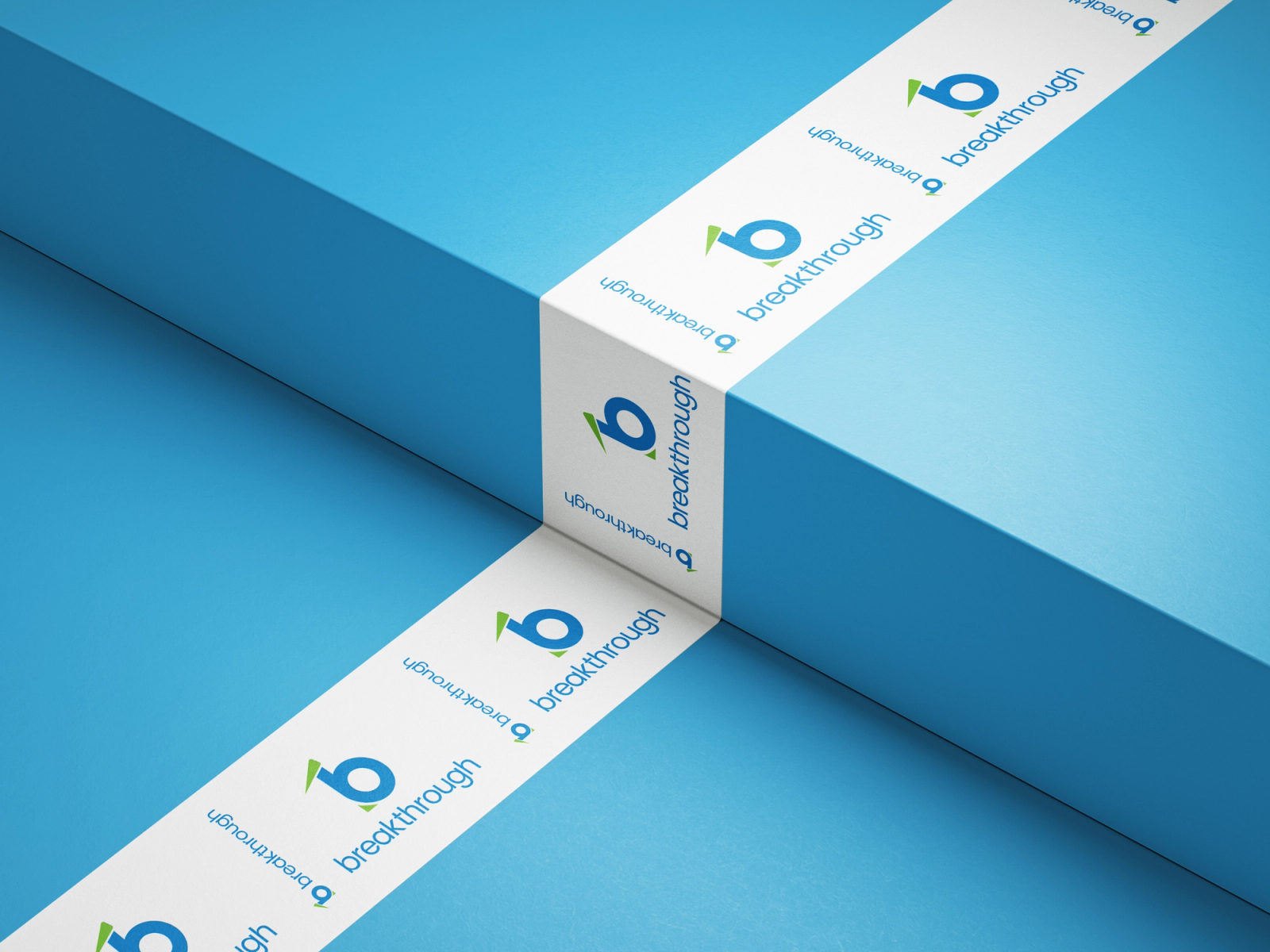
Result and Adaptability: The final visual identity balances creative design with corporate professionalism. The symbol scales cleanly from small business cards and rubber stamps to office banners and large outdoor marketing collateral.
Explore Full Case Study & Mockups: View the complete project presentation and brand mockups on Behance or check out the design shots on Dribbble.